
A trading chart is a sequence of prices of a particular stock over a specified period in the stock market. Unlike before, up to date charts are found online. You can access them using a smartphone, tablet, iPad, laptop or desktop. They are simple at your disposal whenever you need them. Stock Market Learning can be easy if you try to understand the basics.
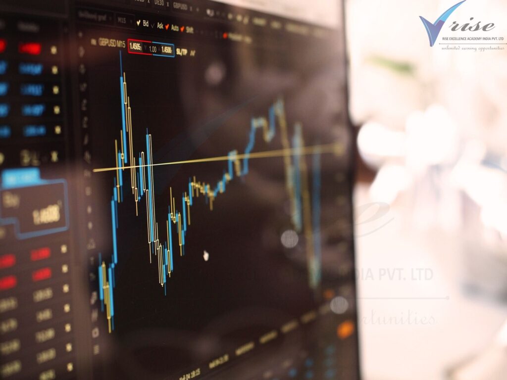
The structure of a trading chart is quite simple. It has a y-axis and an x-axis. The y-axis indicates prices of securities while the x-axis indicates time intervals for the period of the chart. The prices run from left to right across the horizontal axis with figures in the farthest right indicating most recent prices. Trading charts are prepared and interpreted by specialists in the stock market who identify, analyse securities and predict their future prices within a specific period. However, you don’t have to be a technical analyst to be able to read them as they are quite simple to interpret.
Prices of securities are affected by economic and non-economic factors while the chart’s time frame is determined by the amount of data available for a given stock and the ease with which that data can be compressed. Time intervals can be in minutes or hours depending on the period the chart is focusing on. The data in the chart changes from time to time as new buying and selling orders enter the market while old ones are cancelled and filled. There are vital data and price points found at the top of the chart. This data gives information about that particular chart, you must know what this identification data means. By learning all the thinks that we are going to read below you can learn all the the concepts of Stock Market Learning in Hindi as well
1. Company name
This is the entity, a company or fund whose prices are being analysed and shown in the chart.
2. Ticker Symbol
This is a symbol representing the company or fund being traded at that particular time.
3. Bid
This is normally represented by B. It is the highest price a buyer is willing to buy a particular security.
4. Time Interval
This indicates the time the chart represents. It can be in minutes or hours.
5. Ask
This is represented by A. It indicates the lowest price a seller is willing to sell their security.
6. Volume
It is represented by V on the chart. This is the total number of shares being traded by the stock market in a particular season.
7. Last
This is the last price quoted for a certain security.
8. Open
It is represented by O. This is the price for which the stock market has opened that day.
9. Previous Close
This is represented by PC. It is the last closing price of the stock the previous day.
11. High
It is represented as Hi. This is the highest price a stock has traded on that day.
12. Low
Represented as Lo, this is the lowest price a stock has traded on that day.
13. Net CHG
This represents a change in price between the closing price of the previous day and the opening price for the next day. Net % CHG is that change expressed as a percentage of the total price of a particular stock as far as stock market leaning in Hindi is concerned.
Trading charts are classified according to the time frame they represent. These charts can be intraday, daily, weekly and monthly charts. Intraday and daily charts are used by short-term traders and investors in the stock markets. These charts illustrate the prices of stocks within various hours of the day. Weekly charts are used by those traders and investors wishing to analyse intermediate stock prices within the week. Monthly charts are designed for long-term investors and traders. They represent up to years of data for a particular stock market.
Trading charts are represented in the following ways:
● Bar charts
● Line charts
● Candlestick charts
Bar charts are the most complex among the three as they show highs and lows in addition to opening and closing prices. Line graphs have a line drawn from one closing price to another closing price. Candlesticks are the most commonly used because they’re easy to read and interpret, they’re nothing short of visual aids. Let us look at how these three charts are read and interpreted.
Chart Analysis for Stock Market Learning
To guide you on how to correctly read and interpret a trading chart, we are going to use a sample bar chart, a real one for that matter. The chart we are going to use is that of Weatherford International, whose stocks trade in the New York Securities Exchange. The period in question is 14th September 2005 at 4.00pm. And by learning this your stock market learning tactics will improve more.
There are four main stages in a stocks bar chart, namely:
● Consolidation
● Uptrend
● Another consolidation
● Downtrend
The chart above broke out of its consolidation in July and assumed an uptrend. As we share stock market learning, it is imperative that you that a trend is said to be in an uptrend if it is moving forward towards the upper right corner as is the case in our sample chart. This first pullback is the best time for an investor to buy stocks otherwise they’ll have to wait for the next trend.
The trends then change drastically after a certain period (end of July in our case) marking the beginning of the second pullback. You can still buy stocks at this stage but it is unlikely that that particular trend will last long. If a stock does not maintain its uptrend, it gets into another consolidation before it starts falling. This continuous fall is referred to as the downtrend. The chart above can be predicted to maintain an uptrend and this makes it worth investing in, but before we arrive at this conclusion, we need to look at the finer details in the chart.
1. Interpreting Candlesticks
The first thing you need to look at is the price of the stock during a particular period. In our chart, various prices are represented by candlesticks in red, black and white. As the name suggests, these candlesticks are vertical rectangles with a wick extending at its top and bottom. The wick at the top represents a high while the one at the bottom represents a low. Remember the definition of these terms. The nature of the candlesticks will guide you in determining whether you’re dealing with a bull market or a bear market. It will also help you study trends in the chart and make accurate predictions about future prices.
● White candles normally represent a bullish market where prices open near the low and close near the high of the period.
● Black candles are quite the opposite of white ones, they represent a bear market where prices open near the high and close near the low.
● A candlestick with a small body and long wick represents a hammer. A hammer is a pattern in the bull market that indicates an uptrend or downtrend (hanging man).
● A pricing line occurs where a long bear candle is followed by a long bull candle that opens slightly below a bear’s low.
● A bullish engulfing line occurs when a small bear candle is engulfed by a bigger bull candle after a major downtrend.
● Doji and morning stars are bull market patterns that indicate indecision and imminent fall respectively.
● Spinning tops occur when the distance between open and close and that between low and high are negligible. It is an indication that the pattern is neutral.
● When smaller candles overlap on the body of a bigger candle, it causes a Harami pattern. This pattern indicates a loss of interest in a certain stock.
2. Smoothness
The next thing after the price that we need to look out for in this chart is its smoothness. If its trend is smooth like in our sample chart, it means that the stock is reliable and the investor is free to invest in it with confidence. A chart that is not smooth should be a red light about the behaviour of that stock. You can’t give a guarantee that the stocks will go up in the future as we continue to share stock market learning fo beginners.
3. Breakout
As a trader or investor, a breakout is another feature you must look out for while analysing a stock chart. Breakouts happen immediately after the opening bells ring, in the middle or towards the end of the trading period. Always aim to buy a pullback as close to the breakout as possible as this is the best time to measure the level interest of a particular stock. It will put you a step ahead of someone that buys later. Traders use breakouts to decide whether to buy more of a certain stock in the future or not to buy.
4. Range
Moving forward, a stock that is assumed to do well in the future has a relatively wide range of candlesticks across it. A small range means that the stock is progressing in an uptrend but is struggling. Such a stock does not guarantee 100 percent safety and thus should be approached with caution.
5. Patterns
Patterns in the chart are something you also need to look out for though not very significant. As long as the pattern is moving up, its shape does not matter. The pattern comes in handy when we’re confronted with two stocks with almost similar patterns. Always choose the one pattern you can interpret without much difficulty.
6. Gaps
Some stocks will exhibit gaps along the time horizon. As much as these gaps are normal, look out for abnormally many gaps in a chart as this may mean that a stock has had too many buyers already. Many gaps in a chart is an indication that many breakouts have occurred, a time when many pullbacks are bought. Investing in that kind of stock is a major gamble with two extreme outcomes. It could be a huge gain or a painful loss.
7. Fibonacci retracement levels
These are levels that indicate the weakness of a particular stock. A stock is considered safe if its Fibonacci retracement level is above 50%. Any level below that means that the stock is doomed and might collapse any time. Avoid investing in stocks with degenerating prices.
8. Tails and Shadows
These are features at the bottom of the candlesticks that indicate that the stock is getting support from financially powerful individuals and institutions. It means that you are insulated from a possible fall within that trading period. This kind of support is represented by red or green lines running below the candlesticks. A stock that gets support will jump to its previous high, thus maintaining an upward trend. From our sample graph, this trend can be seen between August and September sixth.
9. Volume
As mentioned earlier, the volume is the total number of shares trading in a given period. A stock that has a bigger volume is doing well and many people are interested in it. Although this is a good stock to invest in, it can also turn out to be a risky investment. Too much interest in a particular stock may lead to it being overbought. Its prices will likely fall in this case. Stocks with a low volume pullback, on the other hand, are considered to be struggling. They are still worth investing in but with a lot of moderation. Every next one of its breakouts could be the last unless institutional investors come to its rescue.
Take Away
Having gone through all the basics and details about trading charts, it is now time for you to familiarize yourself with as many of them as possible and interpret them accordingly. These terms and features might look scary at first but trust me, they will be second nature every next time you interact with each.
You should be flexible enough to realize that the thousands of new charts you meet every day require the exact approach like this one so you shouldn’t be intimidated. After a while, you will be able to prepare your charts which will be much easier to interpret compared to those that have been prepared by someone else. Lastly, keep in mind that nothing is ever certain in the stock market even with a correct analysis of the charts. The unpredictability might be caused by external factors like government policies that might come sweeping through the market like a tsunami, catching everyone unawares and causing chaos. Explore our Stock Market Learning course In Hindi as well.